この記事を三行にまとめると
画像を変化させるアニメーションHTMLを変化させるアニメーション
アハッ☆(´Д`*)
この記事は以下の動画の中に出てきたサンプルコードを載せたものです。コピペなどが必要なときに使ってください。
JavaScript
CSS
JavaScript
CSS
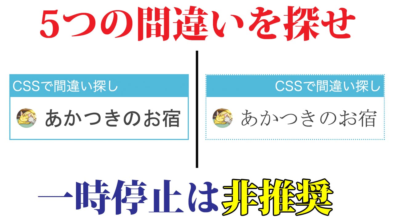
画像を変化させるアハ体験
HTML<div class="container">
<img src="before.png" alt="変化前" id="before">
<img src="image2.png" alt="変化後" id="after">
</div>
<button type="button" id="start">START</button>JavaScript
start = document.getElementById('start');
start.onclick = function() {
  after = document.getElementById('after');
  after.classList.add('fade');
}
CSS
.container {
  margin: 20px auto;
  width: 640px;
  height: 360px;
  position: relative;
}

img {
  position: absolute;
}

#image2 {
  opacity: 0;
}

.fade {
  animation: fadeIn 5s forwards;
}

@keyframes fadeIn {
  from { opacity: 0 }
  to { opacity: 1 }
}

#start {
  display: block;
  margin: 0 auto;
  width: 640px;
  padding: 5px;
  font-size: 24px;
  border: solid 1px;
  cursor: pointer;
}

#start:active {
  background: #ddd;
}
HTMLを変化させるアハ体験
HTML<div class="container">
<p id="logo">あかつき<span id="no">の</span>お宿</p>
</div>
<button type="button" id="start">START</button>JavaScript
start = document.getElementById('start');
start.onclick = function() {
  logo = document.getElementById('logo');
  no = document.getElementById('no');

  logo.classList.add('fade');
  no.classList.add('rotate');
  start.classList.add('radius');
}
CSS
.container {
  margin: 20px auto;
  width: 620px;
}

#logo {
  display: flex;
  align-items: center;
  justify-content: center;
  box-sizing: border-box;
  margin: 0;
  height: 180px;
  font-size: 72px;
  color: #fff;
  box-shadow: 0px 0px 0px 10px #0068b7;
  background: #0068b7;
  border: dashed 4px #fff;
}

//ボーダーの上を消すアニメーション
.fade {
  animation: fade 10s forwards;
}

@keyframes fade {
  from { border-top-color: #fff }
  to { border-top-color: #0068b7 }
}

//「の」の字を回転させるアニメーション
.rotate {
  animation: rotate 10s forwards;
}

@keyframes rotate {
  from { transform: rotate(0) }
  to { transform: rotate(90deg) }
}

#start {
  width: 640px;
  padding: 5px;
  font-size: 24px;
  border: solid 1px;
  cursor: pointer;
  display: block;
  margin: 0 auto;
}

#start:active {
  background: #ddd;
}

//ボタンの左上を角丸にするアニメーション
.radius {
  animation: radius 10s forwards;
}

@keyframes radius {
  from { border-top-left-radius: 0px }
  to { border-top-left-radius: 10px }
}